
Doctor for You - Healthcare app
Overview
Client: The Daily Health Conference. Is a fictional non-profit organization dedicated to promoting health and wellness through impactful public talks, workshops, and professional training.
Goals: Create a native mobile app, and create a design system that reflects an innovative approach to wellness.
Role: Product designer, User research, Visual design, Prototyping & Testing, Information architecture
Timeframe: one week

Revenue in the Digital Health market is projected to reach US$170.20bn in 2023.
Revenue is expected to show an annual growth rate (CAGR 2023–2027) of 10.78%,
resulting in a projected market volume of US$256.30bn by 2027.
Research
With the increasing use of smartphones and mobile devices, there is a growing demand for medical apps that can help patients manage their health and wellness.
For the competitive analysis and market research we studied three extremely popular medical apps: Teladoc, MyChart and Doctolib.
To collect quantitative data we created an online survey, In this process we collected data to have an idea of what are people’s habits when it comes to their medical routine and the use of apps.
What does our pool of users do? Do they use apps to handle their medical needs? Are they aware of what is needed to do the right prevention?
Our survey reached 44 users from the age of 20 to 50 across 8 countries.
To collect qualitative data we interviewed three users using video calls and a studied set of questions on the topic.

Feature comparison analysis
We compared three medical apps for this design challenge: Teladoc, MyChart and Doctolib.
All the three of them, Teladoc, MyChart and Doctolib offer the basics of what a medical-care app should have.
Appointment Scheduling: This feature enables users to schedule appointments with their healthcare providers, view upcoming appointments, and receive reminders.
Telemedicine: This feature allows users to connect with healthcare providers through video conferencing, phone calls, or messaging for remote medical consultations.
Calendar Sync: downloading the appointments to your calendar
Test Results: This feature enables clinics to upload test results to the patient’s account, in order for them to view the documents directly in the app.


Online survey
Tool: Google Form
Participants: 44 people
Age span: 20 to 50
Number of different countries of origin: 8

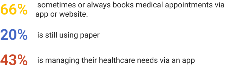
The results of the online survey show that:
43% of the users is managing their healthcare needs via an app, and 66% sometimes or always books medical appointments via app or website.
A big amount (20%) is still using paper notes.
Moreover, results indicate clearly that although communicating in person with a specialist is still the favorite solution (90%), comfort and ease play an important role in the decisional process.
Especially when it comes to healthcare, we have to consider that not always commuting and moving from home is possible or simple for the user.
Not to mention time issues, which we assume are another factor. We will dive into this particular theme with our interviews.
Our pool of users are in the ages where prevention begins. gIt is a huge missed opportunity, both for individuals and for the public system, in terms of costs reduction and health.


Interviews
Tool: video call with recording function
Participants: 4 users
Age span: 22 to 40
Thanks to the interviews, three main pain points emerged:
1. Lack of availability of a trusted Online Doctor
2. Difficulty keeping track of Medical History and Documents
3. Complex and too much Paperwork
During our research, in order to highlight users feelings, we used the empathy map: what we found is that users recall anxiety and overwhelm when managing appointments, reimbursements, long waiting times, or when an easy way to contact the trusted specialist was not available.
“I would like to have medical history (appointment and test result) reminders of appointments, view and renewal recipes.”
S.
“The whole process is really overwhelming. It happens that my calls get rejected.”
S.
“Every time I go to a doctor I have to begin from zero.”
J.
“I don’t like to wait at the studio, especially when the doctor is late. In person visits can be a waste of time and sometimes unnecessary.”
A.

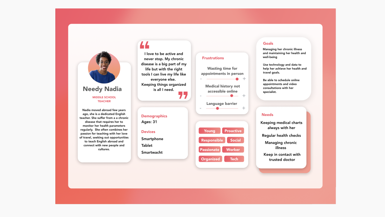
User Persona
Based on comprehensive data analysis, we have developed a primary user persona named Nadia.
Nadia is a 31-year-old professional who leads an active and adventurous lifestyle. She has a chronic condition that requires her to diligently organize and manage her medical documents and clinical exams. Nadia frequently needs medical check-ups and prescriptions, and she seeks the convenience of accessing these services through a mobile app instead of investing time in planning in-person appointments.
Still based on our user research, the pain-points where we can act are:
Nadia is looking for appointments and doesn’t find availability on her insurance website
She is at the appointment and has to explain her condition and show exams, and doesn’t have a document required or the doctor has only a limited amount of time and can’t carefully review her history.
She forgets to take her medication in the due day because she didn’t update the calendar.
She needs to buy medications, but the pharmacy always require a doctor recipe, making her life stressful and filled with calendar reminders to call the doctor and tale an appointment on time.
She looks for the next appointment to get a new prescription and it’s too far ahead. She will need to go there in person, although doesn’t need a physical visit but just a prescription renewal.
We tackled Nadia’s pain points: below is what her journey looks like in the future.
User Journey
Nadia’s journey begins when she needs to find a solution to her health-care routine organizational issues, and decides to download a promising app that should store documents, history, recipes and offers a Teledoctor feature. Remote health care — here we go!!
When booking a consultation, her hopes are that the doctor could be informed via the document that she had previously uploaded via her new app dashboard, and that they won’t need to talk so long about her history again.
She can find quickly an appointment due to the wide amount of doctors and specialists available online, from the whole country.
The documents shared offer a good overview of her problem, and they are visible to the specialist via the app.
Finally she can connect and have the consultation online, store her documents, and find herself being very satisfied with the process. The doctor asked her only few questions, and the rest was clear by the documentation.
Nadia is now able to maintain her health under control, also when she does not have so much time and can’t meet the doctor in person.


Problem Statement
Young busy individuals need to find a way to organize check ups and medical documents in an app because they don’t have an efficient healthcare system with digital access.
MoSCoW method
Our Design Challenge focuses on healthcare system for people like Nadia. Not only it should take care of prevention — but also keep track of a condition and monitor values using a wearable device. We want to develop an app that is more comprehensive than Doctolib, and that offers what we have seen is already common in health apps used in the USA, like Teladoc or MyCharts.
As showed below, the feature prioritization also includes the features that the other studied apps have. After very common ones, as Dashboard and Notification, we added Statistics, Medical History, E-prescribing and Virtual Visits as must haves.

MVP
Our medical care app MVP will provide a simple and user-friendly interface for patients to access healthcare services remotely.
The core features will include the ability to schedule appointments with doctors, receive virtual consultations, access medical records and set up a personal goal’s dashboard connected with wearable devices.
The app will target busy professionals and people with health issues who need convenient and quick access to healthcare services.
The MVP will be developed for Android platforms and will be designed to comply with all relevant privacy and security regulations.
Ideate
To implement our creativity and begin designing solutions, we sketched different happy-paths that included our core features.
We liked the idea to have a home page showing a list of favorite professionals and access to education on topics of prevention and health.
The profile page should grant access to more personal documents, the scheduled appointments, and the dashboard representing goals and health tracking parameters from wearable devices.
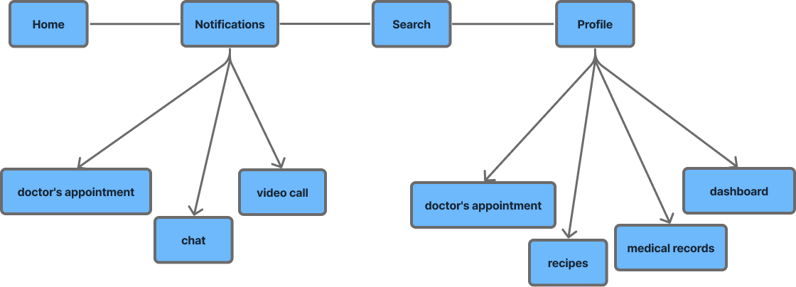
Sitemap of the app nav bar
Sketches
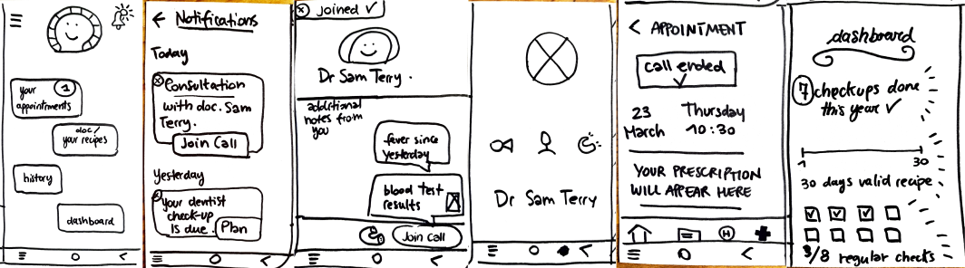
We voted the recurrent solutions and those that looked the clearest to understand.
The concept testing informed which version is more useful and covers our users’ pain points.
To be consistent with the user journey and the user needs, we ideated three possible user flows.
Upload personal documents.
Online video-consultation with an expert with online viewing of prescription
Viewing of personal dashboard where thanks to a data visualization panel, Nadia can see her health parameters.
Mid-fi Prototype
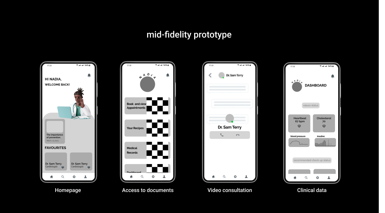
We have a homepage with generic information, and immediate access to articles and Favorite Doctors list. The profile page grants easy access to Personal Health Record (PHR), Prescription Management and Dashboard. Here you also see the video consultation screen with the specialist.
After an extensive exploration of the UX process, it’s important to remember that the UI, user interface, also plays a critical role in the overall success of any digital product. In the case of our app, we’ve intentionally designed the user interface with two main goals: reflecting consistent theme for the topic and ensuring accessibility and ease of navigation for all users. This is especially crucial given the app’s focus on medical studies, where clear and intuitive UI design can help users better comprehend and engage with complex material.
Visual

Moodboard
To help guide our design process and ensure that our app’s user interface actually communicates its theme, we created a mood board that encapsulates our desired attributes of care, serenity, modernity, empowerment, trust, and professionalism.
the mood board helped us to ensure that the app’s design choices align with our mission and resonate with our intended users. Care, Serenity, Modernity, Empowering, Trust, Professional: The brand statement wishes to represent an app that is not only taking care of the organizational aspect, but also accompanies our users in the journey of a better understanding of their needs and due prevention, avoid any unnecessary suffering and illness and empower them to have, with our help, their own life under control.
Style tiles
To further refine our app’s visual style, we created style tiles. These allowed us to explore and experiment with different color schemes and other design elements quickly and efficiently. the style tiles helped us to establish the app’s overall visual identity and ensure consistency across all screens and functions.
We used a deep blue that inspires trust and professional, and round-angled buttons for a smoother look. Icons are mainly 3D or blue simple icons. Our goal is to look professional, yet friendly.
The app name Doctor for you, and logo were chosen with the same criteria.
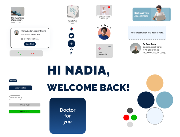
High-fi Prototype
Testing
During the testing phase of the high-fidelity prototype, the results confirmed that the app is smooth and that the design is clean. After the test, we improved spacing, navigation issues, visibility of the data privacy screens and improved the naming of components for smoother transition. (nerdy detail but actually essential to avoid the wicked and wobbly look) Based on this feedback, we made the necessary adjustments to the prototype.
Interactive prototype
In the video below, the three short user flow are shown. First, uploading documents in the personal profile for the specialist viewing, second, the online appointment and doctor’s profile, and third, the view of the data visualization dashboard with health parameters to check. The home page has an introduction and educational aspect: with selected articles available here, the user can be informed about prevention methods, studies and tips from out client: The Daily Health Conference.
Conclusions
Medical apps have an infinite number of potential features, making it difficult to prioritize for an MVP. With the help of our target audience and main persona, and by testing and refining our designs through various methods such as mood boards, style tiles, and user testing, we designed a user interface that solves the problems of our client and our audience at the same time.
Our next steps include adding an e-commerce platform for online pharmacy services and connecting prescriptions with medicine shipments. We also plan to implement a doctor’s interface with a user-friendly UI and patient management system.
I want to thank specially my teammate Rosanna for inspiring constructive conversations and critical thinking over the whole process.