

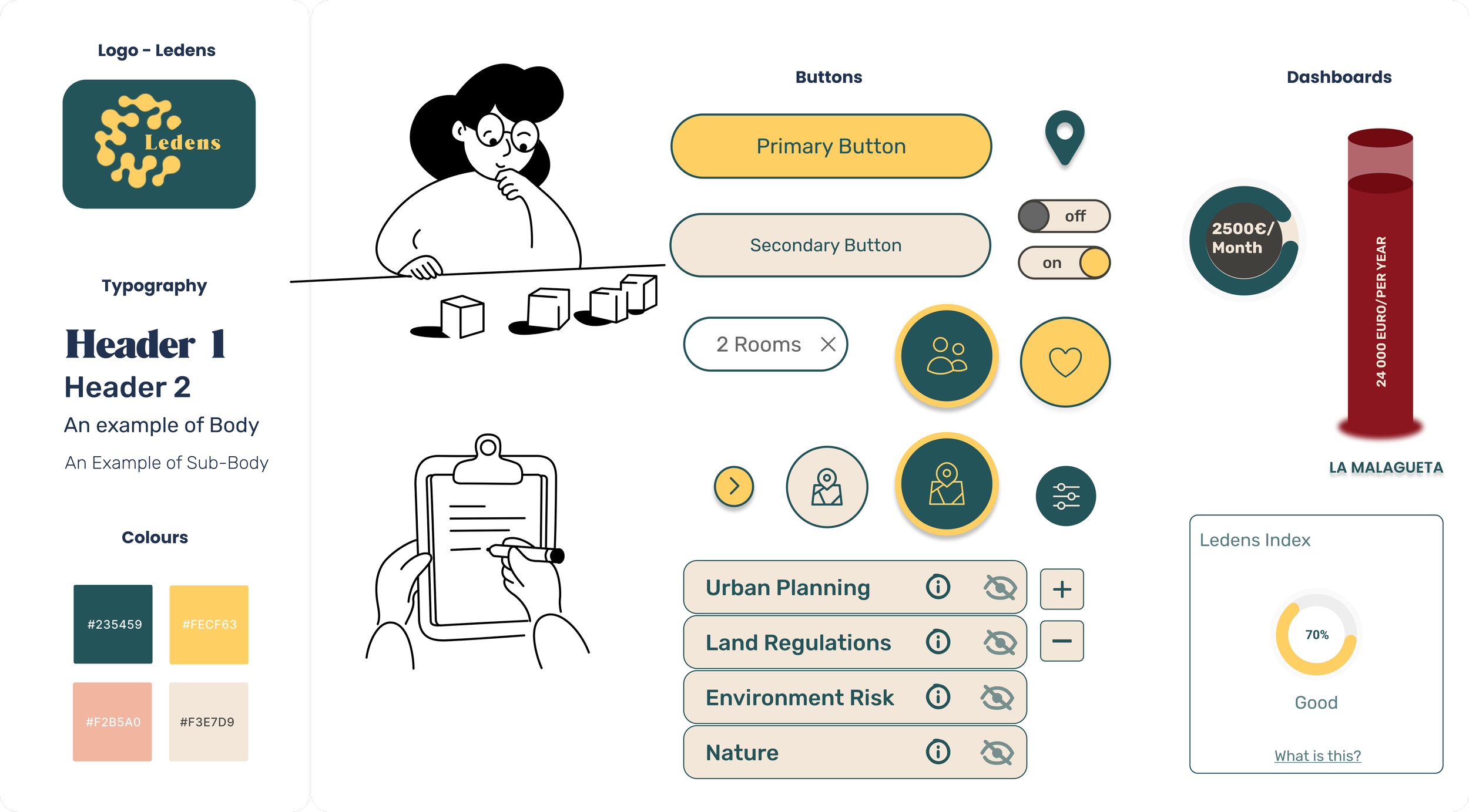
Ledens, a Website for investors in the real estate market
Overview
Ledens aims to be an online service for investors and real estate stakeholders in Spain. Currently without online presence, the founder of this young company is CEO Álvaro Navarro, who wants to create a startup business within the real estate market, and needs a team of UX UI Designers to create the MVP.
Client
Convert PGOU (Plan General Ordenación Urbana - for Spain) and other socio economic data into one user-friendly online interface.
Making the real estate data accessible to non experts and be cost-transparent.
Facilitate analysis of data for non experts.
Create an intuitive geo-located interface.
Goals
Two weeks
Time-frame
Product designer, User research, Market research, Prototyping and testing.
Role
In Europe, two thirds of the people live in an owned house. In 2021 the home ownership rate for Spain was 75.8%. *
We collected 30 forms, and interviewed 4 users, spanning from 25 to 40 years old: private person, real estate agent and architect.
The results highlight the following problems:
Understanding the main consequences of owning vs renting
Which online platform to use for finding help & info
Urge to invest in a property, willing to buy as investment
Understanding the mortgage details and best timing to make a good investment
*Sources: European commission; Statista.com
User research


Considering our interviews, we created our primary persona: Carlos Müller.
Carlos is a young adult with a partner and a good job, but still renting his flat instead of owning it. His goal is buying a property. He likes to be informed and make good deals.
He is tech savvy and has already spent some time doing research on other platforms but needs assistance and guidance from experts or a clear information platform.
User Persona

User Journey
One of our users spent 3.5 years in the process of buying.
As we all know, buying a house is one of the biggest investment in our life and requires time.
This brought to the conclusion that the user journey must be quite long.
We want to reach out as soon as our main user, Carlos, begins looking for information online, and show him that he can be in control of checking all the possibilities on the market with transparency.
We want to guide him into the selection of his criteria (near the city, near a train station and a fitness studio, where the housing costs are not excessive etc) with our ability of designing for users like him, non experts or architects, and give him the chance to contact an agent in the moment of need. For example, to understand the most recent market trends.

Market research
Secondary Research
We started with market research already before the client workshop. Since real estate is an interesting market for many types of investors, we collected websites and platforms that represented the main market areas where private investors could operate.
During the workshop with our client, it was very helpful to learn from him which competitors he was most careful about.
We focussed on Spain, including competitors from Germany and UK.
For the five main competitors that we found, we analyzed services, pricing, market share, marketing, strengths and weaknesses, customer base, technologies, trends.
Benchmarking


Problem Statement
Young individuals with family plans, interested in investing in real estate,
need to find a way to gain clarity on the market options to buy the perfect property,
because they feel overloaded and confused with the complex criteria and lack of overall transparency of the process.
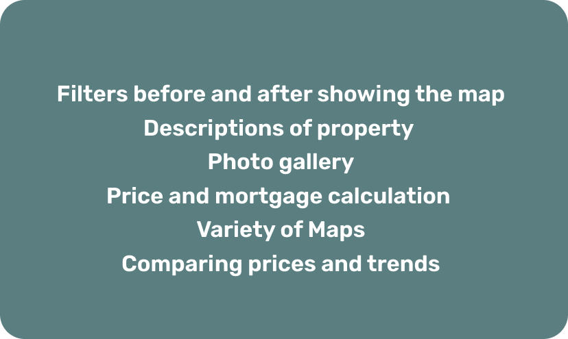
Real estate websites are very complex, full of features. In order to satisfy our user and overcome our main competitors we listed the must have features to include in the MVP.
MoSCoW method
Client Requests

Users Requests
User flow with Ledens
Setting concrete steps for the user journey is essential to know if the journey allows a good user experience, and identifies the next steps avoiding redundancy.
We realized that the user journey in this case can end with the user contacting the property owner. There can be the chance to edit contracts online, as we have seen in some competitor’s websites.
Special attention is given to the geo-data layers, that can be personalized.

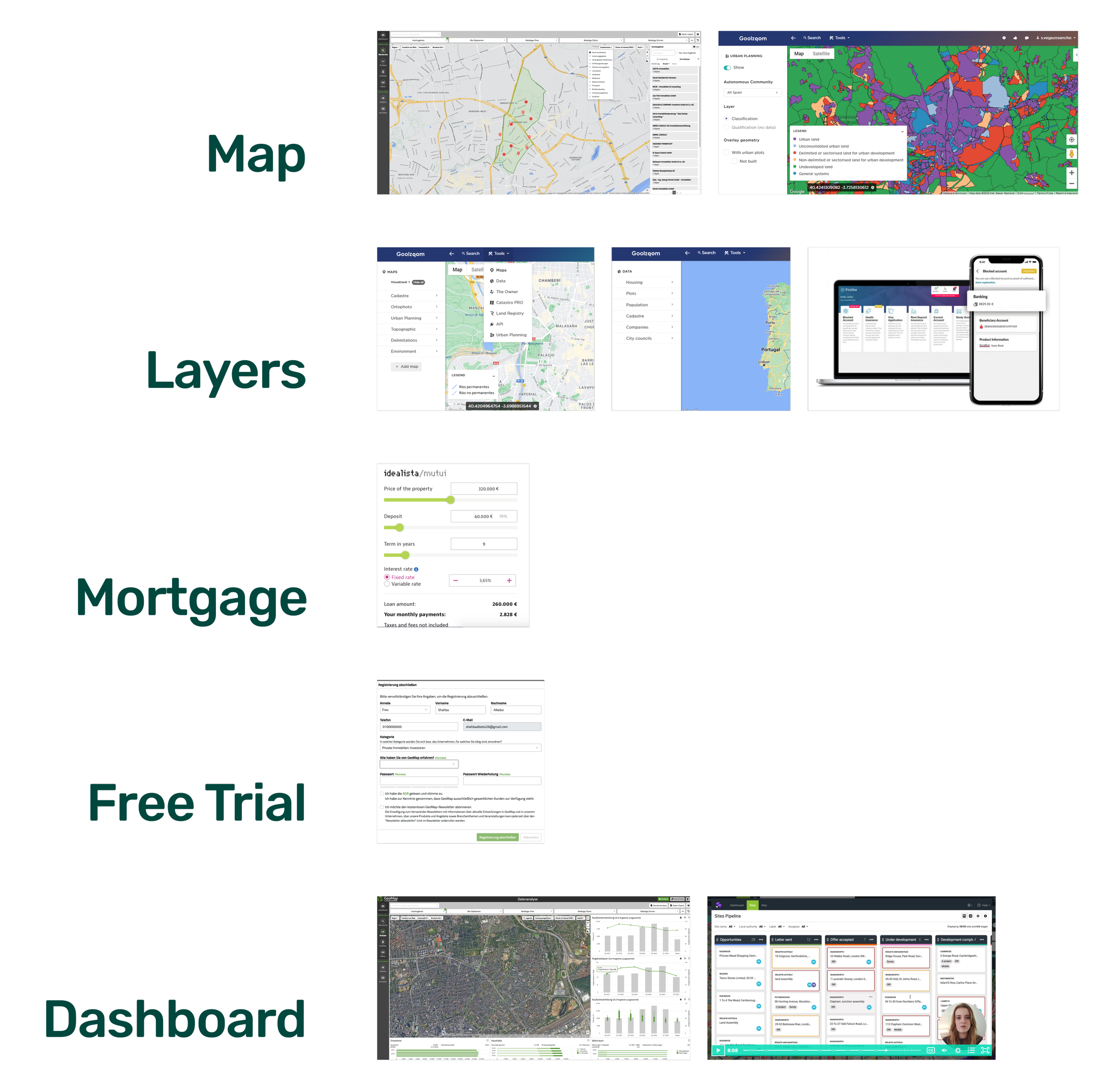
Considering each feature, there has been a lot of research on many other websites to find what could inspire a similar feature.
At the end it was found a good representation of Geo-data, layers and dashboard, that we personalized for our own purpose.
Ideation
Concept Sketching & Testing
Sketching began on paper, and after voting the ideas of everyone in the team we used a very first draft to ask for feedback on the clarity and usability of the website architecture.
Feedback 1
I want to see the value on the place
make the storytelling clearer
explain the action: analyze data
put testimonials further above, reviews on the top
add protected area in the maps
add environmental risk
for facilities, specify: free time activities, schools, report distance
add cost of the land
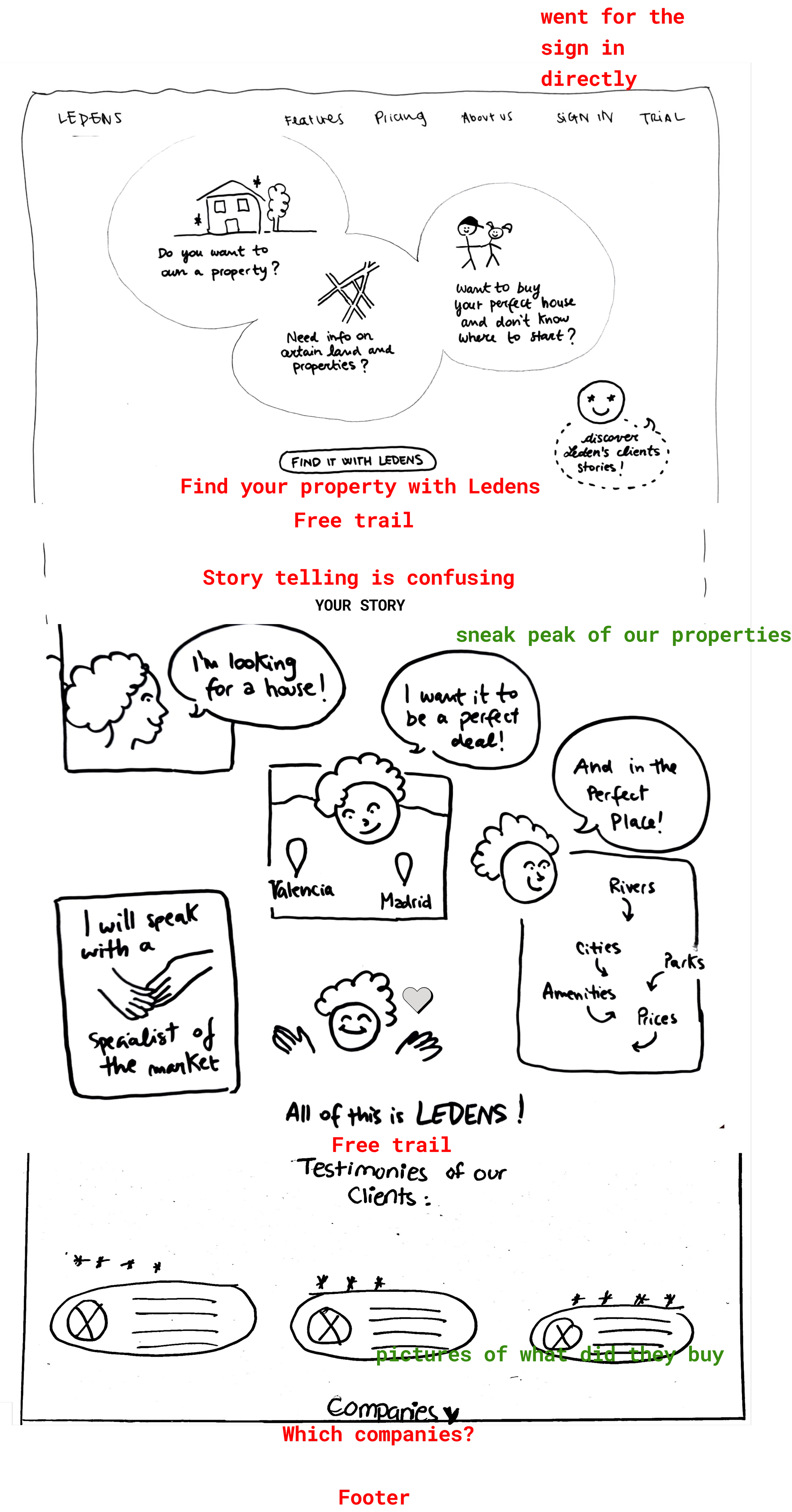
Feedback 2
14 days not visible
why a free trial? explain the product
add possibility to select location
Mid-Fidelity wireframes
As a result of the feedbacks and improvements, we have a mid fidelity wireframe.
The prototype, even in mid-fidelity, looks quite real and is improved with prioritization of the features and the complete website architecture.
Once again there will be more research and testing before we decide colors, fonts, and the overall mood we want to give to the product.
Below there is a gallery with the mockups of the landing page, the onboarding, the map with its filters, and the property comparison feature in mid-fidelity.
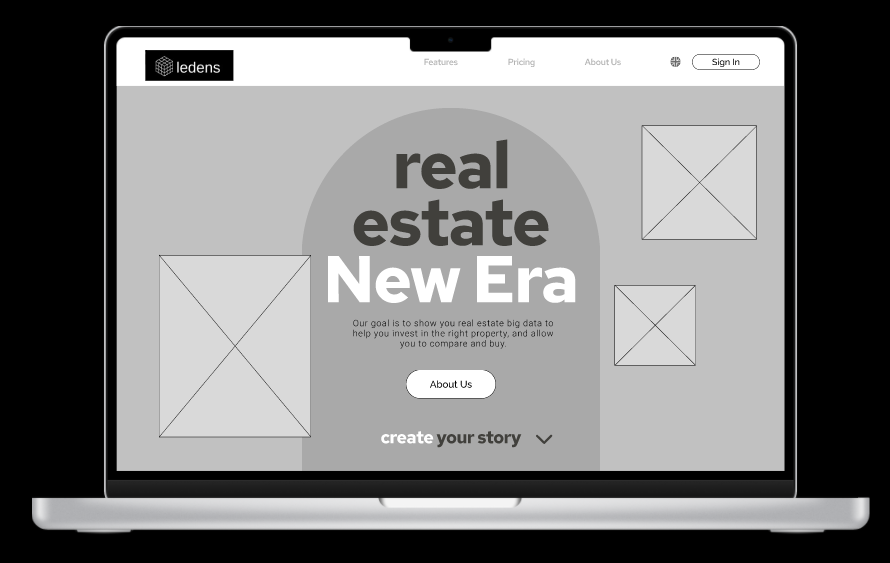
Landing page

Pricing

Onboarding

Map

Right tab to personalize research with filters

Left tabs with geo-data and socio-economic data from the public urban planning of Malaga

Preview of a property

Map with property view

Property details
Moodboard & Style tiles

After a meeting with our client we all agreed on a style that would be softer and more friendly compared to other real estate or geo-data platforms.
Also, colors should be relaxing and inspiring trust and ease, so our choice for shapes, fonts, and icons.
Starting with the Moodboard to begin visualizing the style of our product. Let’s define the type of customer experience that we are delivering.
High fidelity prototype
⋆
High fidelity prototype ⋆

Landing page

Pricing

Onboarding

Personalizing the initial results

Map

Left tab with geo-data and socio-economic data layers

Right tab for personalizing filters

Preview of selected property on the map

Full description of the property with photo gallery

Graphs with trends and contact form

Comparison between saved properties

Financial information and mortgage calculator

Happy path completed - End page
Interactive prototype
⋆
Interactive prototype ⋆
You can visit my portfolio on laptop to try the interactive prototype with Figma.
Conclusions
This two weeks design sprint was extremely useful to understand the client’s needs, how to organize a workshop and set the right priorities in the timeframe available.
The most important part is the communication between the client and the team. I realized that it is crucial to explain what is possible and the realistic size of the project outcome.
After all, I also realized how important it is to find the matching users to interview. Indispensable for a successful development of the product.
This project wouldn’t be possible without Sara, Shahba, Alvaro, and my teachers ❤️
Next steps
-
Geo-data
Integrate more geo-data and layers to the map, as well as socio-economic data.
-
Owners Interface
Create interface for property owners to manage their portfolio and receive requests via Ledens.
-
Partners
Professionals of the real estate market can serve as consultant partners, for the future this feature should be added together with the owner contact form.